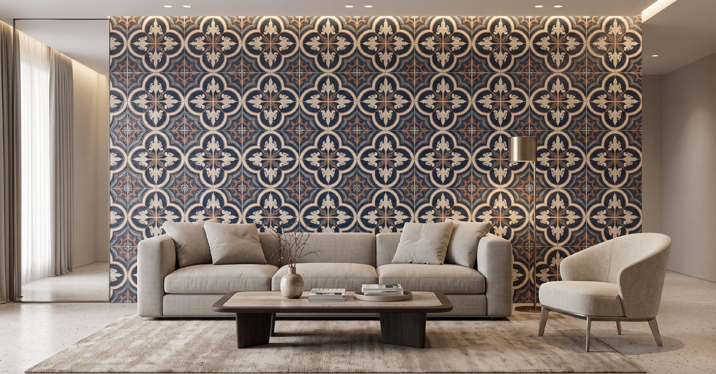
A wall can be many things. A backdrop. A boundary. A way to divide a room. Or, with the right tile, the most memorable surface in the house.
That shift is at the heart of contemporary tile design. Walls are no longer expected to quietly sit behind the furniture. Designers are using them to introduce colour, texture, pattern and even a sense of craft. Architectural Digest’s 2026 design forecast points to a move towards personalised tilework and hand-painted surfaces, while international tile trends are leaning into three-dimensional textures, sculptural relief and material variation.
Indian homes are moving in the same direction. Recent design coverage points to warmer palettes, large-format surfaces, earthy mattes, terrazzo, fluted textures and more expressive bathroom and kitchen walls.
The trick is knowing what deserves to stand out, and what should quietly support it.
Start With The Space, Not The Tile
It is easy to fall in love with a tile in a showroom. The harder question is whether it belongs in your home.
Before looking at wall tiles design, look at the wall itself.
Is it large and uninterrupted, or broken up by windows, shelves and cabinetry? Does it receive natural light? Is it a bathroom wall exposed to moisture, a kitchen backsplash dealing with oil and heat, or a living-room surface that is purely decorative?
The answers will determine how adventurous you can be.
A large, simple wall can carry a bold pattern beautifully. A smaller wall may benefit more from a detailed texture that rewards a closer look.
Think about everything around the wall, too. Flooring, furniture, cabinetry, lighting, mirrors and hardware are all part of the composition.
The best designer wall does not exist in isolation. It makes everything around it look more intentional.
The New Statement Wall Is About Personality
There was a time when a feature wall meant one thing: pick a contrasting colour and paint it darker.
Tiles have made the idea much more interesting.
Today, a statement wall can be built around texture, scale, material, colour or pattern. It can reference natural stone, handmade ceramics, traditional craft or contemporary geometry.
And increasingly, designers are moving away from perfectly coordinated interiors towards spaces that feel more personal and collected. Architectural Digest’s 2026 forecast specifically highlights the rise of personalised tilework and hand-painted tiles as homeowners look for surfaces with a stronger sense of identity.
That is perhaps the biggest lesson when choosing designer tiles for wall: do not choose something simply because it is fashionable. Choose something that gives the room a point of view.
Texture Can Say More Than Colour
If you want impact without going bold on colour, start with texture.
Fluting, ripples, waves, relief patterns, ridges and sculptural surfaces are among the strongest directions in tile design right now. Cersaie-related trend reports have highlighted three-dimensional tiles that use light and shadow to create movement across a surface.
This makes texture particularly effective in neutral interiors.
Imagine a warm beige bathroom with a softly ridged wall behind the vanity. Or a cream kitchen with a handmade-look backsplash. The colour remains restrained, but the surface gives the eye something to discover.
Texture also changes throughout the day. Morning light might emphasise one side of the relief, while evening lighting creates deeper shadows.
It is a quieter kind of drama.
Colour Is Having A Warmer Moment
The all-white wall is making room for colour.
Across current Indian tile collections, earthy mattes, sage greens, warm neutrals and terracotta tones are gaining attention. Globally, designers are also leaning towards richer, more saturated and personalised colour palettes rather than safe, neutral interiors.
But colour does not have to mean bright.
A dusty olive can bring nature into a bathroom. Deep blue can make a kitchen backsplash feel more architectural. Terracotta can warm up a dining area. A soft clay or sand shade can make a neutral interior feel considerably richer.
The easiest way to experiment is to use colour selectively.
A powder room, vanity wall or kitchen backsplash gives you the freedom to take a bigger design risk without committing the entire room.
Glossy, Matt Or Somewhere In Between?
The finish can completely change the personality of a wall.
Glossy
Glossy tiles bounce light around the room, making them particularly effective for smaller bathrooms and darker corners. They can also bring depth to saturated colours, giving a green, blue or burgundy tile a jewel-like quality.
Glossy finishes work especially well on bathroom walls and kitchen backsplashes, where their reflective quality becomes part of the design.
Matt
Matt surfaces feel softer and more grounded. They work beautifully with stone-inspired designs, earthy colours and contemporary interiors.
They are also useful when you want texture to be the main attraction rather than shine.
Textured
A textured tile can be matt, glossy or somewhere in between. What matters is the surface itself.
Ridges, waves, handmade irregularities and relief patterns create shadows and movement, making a relatively neutral tile feel much more dimensional.
There is no need to choose one finish for the entire home. Contrast can make a design more interesting.
A matt floor with a glossy wall, for example, can create a subtle dialogue between surfaces.
Large Format Is Making Walls Feel More Architectural
Large-format tiles are increasingly being used beyond floors.
On walls, they can create a quieter, more continuous appearance by reducing grout lines. This is particularly effective in bathrooms, where fewer joints can give the room a more seamless, architectural quality. Recent Indian bathroom design coverage identifies large-format tiles as a major direction because they can visually expand compact spaces while reducing grout lines.
Large-format marble and stone-inspired surfaces can also make a wall feel almost monolithic.
But bigger is not automatically better.
A smaller tile can create more rhythm, especially when the pattern or layout is part of the design. The right scale depends on the room and the effect you want.
Pattern Is Back, But It Is More Personal
If texture is subtle drama, pattern is the more confident option.
Pattern wall tiles can transform a backsplash, powder room or vanity wall almost instantly. Geometric designs, botanical motifs, traditional-inspired patterns and decorative compositions can all give a room a distinct identity.
There is also growing interest in patchwork-style walls, where a controlled mix of colours, finishes and patterns creates a collected, individual look. The key is cohesion: a common colour palette can keep a varied combination from feeling chaotic.
For a more sophisticated result, choose one dominant pattern and let the rest of the room stay quiet.
Or take a single pattern and change its layout.
Sometimes the most interesting wall is not the one with the busiest tile. It is the one where the tile has been arranged unexpectedly.
The Layout Is Part Of The Design
The same tile can look completely different depending on how it is installed.
A rectangular tile can be stacked vertically to emphasise height, laid horizontally to visually stretch a wall or arranged in a more traditional offset pattern.
Small-format tiles can create rhythm. Large-format tiles can create calm. A border can frame a niche. A contrasting tile can define a vanity.
This is why it is worth seeing a tile in more than one layout before making a decision.
A simple rectangular tile can suddenly feel contemporary when stacked neatly. A classic shape can feel playful when arranged in a herringbone pattern.
The tile is only one part of the design. The space between the tiles is part of it too.
Grout Deserves More Attention Than It Gets
Grout is often treated as the last decision. It should not be.
A closely matched grout can make individual tiles visually recede, creating a more continuous surface. A contrasting grout can emphasise every tile and turn the layout into part of the pattern.
This is particularly important with geometric or handmade-look tiles.
If the tile is already expressive, matching grout can keep the overall composition calm. If the tile is simple, contrasting grout can give it more definition.
It is a small decision that can change the entire wall.
Designer Tiles For Wall: Where Should You Use Them?
You do not need a huge wall to make an impression.
Kitchen Backsplash
This is perhaps the easiest place to experiment. A patterned, textured or colourful tile can bring personality to a simple modular kitchen without changing the cabinetry.
Bathroom Vanity Wall
The wall behind the vanity naturally draws attention. Use texture, colour or a stone-inspired surface to create a focal point.
Shower Area
A statement shower wall can give a bathroom a more immersive feel. For wet areas, however, the tile and installation system should be suitable for the conditions.
Entrance
A tiled foyer wall can create a strong first impression without taking up valuable floor space.
Living And Dining Areas
Tile can be used selectively behind a console, bar, display unit or dining area. A textured wall can feel almost architectural, particularly when paired with carefully placed lighting.
How To Choose A Statement Tile Without Regretting It
A beautiful tile is one thing. Living with it is another.
Here are a few things worth doing before you commit.
Take samples home. Showroom lighting can change how a tile looks.
Look at it at different times of day. Texture and colour can shift dramatically between daylight and artificial light.
View several tiles together. One sample cannot show you how the pattern will repeat.
Consider the scale. A tiny tile can feel busy across a large wall, while a large tile may overwhelm a compact space.
Think beyond the trend. Ask whether you would still like the tile if you stopped seeing it on Pinterest and Instagram tomorrow.
Coordinate, do not match. Your wall does not need to repeat the exact colour of your floor or cabinetry. It simply needs to work with them.
Plan the installation. Alignment, grout, corners, niches and edges can make or break the final result.
When A Statement Tile Should Stay Quiet
Not every room needs a statement wall.
If your flooring is heavily patterned, your furniture is colourful and your lighting is dramatic, another expressive surface may simply create visual noise.
Sometimes the best choice is a quiet stone-look tile that lets the architecture speak.
This is especially important in open-plan Indian homes, where one strong material may be visible from several rooms. Think about the view from the living room into the kitchen, or from the entrance into the dining area.
Good design is not about making every surface interesting.
It is about deciding which surfaces deserve attention.
The Beauty Is In The Balance
The most memorable designer wall tiles are not necessarily the loudest ones.
They have a sense of proportion. They respond to light. They work with the architecture. They bring texture, colour or pattern into the room without overwhelming everything around them.
A deeply coloured glazed tile can make a bathroom feel jewel-like. A softly textured beige wall can bring warmth to a minimalist home. A patterned backsplash can give a kitchen its personality. A large-format stone-inspired surface can make a compact room feel more expansive.
The possibilities are broad because walls give you something floors often cannot: freedom to experiment.
And perhaps that is why the statement wall is evolving. It is no longer about creating a single dramatic moment for a photograph. It is about creating a surface that feels right every time you walk past it.
At Unispace, you can explore wall tiles across colours, textures, patterns, finishes and formats, and see how different surfaces can work with the wider material palette of your home.
Ready To Give Your Walls A Point Of View?
Explore designer wall tiles at AparnaUnispace and find a surface that does more than fill a wall. Find one that gives your space its own character.